For Global Accessibility Awareness Day (GAAD) 2026, I prepared a new version of I Need That Widget with better accessibility support. Although the app is focused on widgets, I wanted to support accessibility in as many places as I could in the app.
It was my first time working seriously on accessibility, so I wanted to share my experience, what I changed, and what I learned from it.
What is Accessibility?
Global Accessibility Awareness Day (GAAD) is an annual event held on the third Thursday of May. The main goal of the day is to encourage people to talk, think, and learn about the importance of digital accessibility. Accessibility means designing apps and digital experiences so people with disabilities can perceive, understand, navigate, and use them effectively.
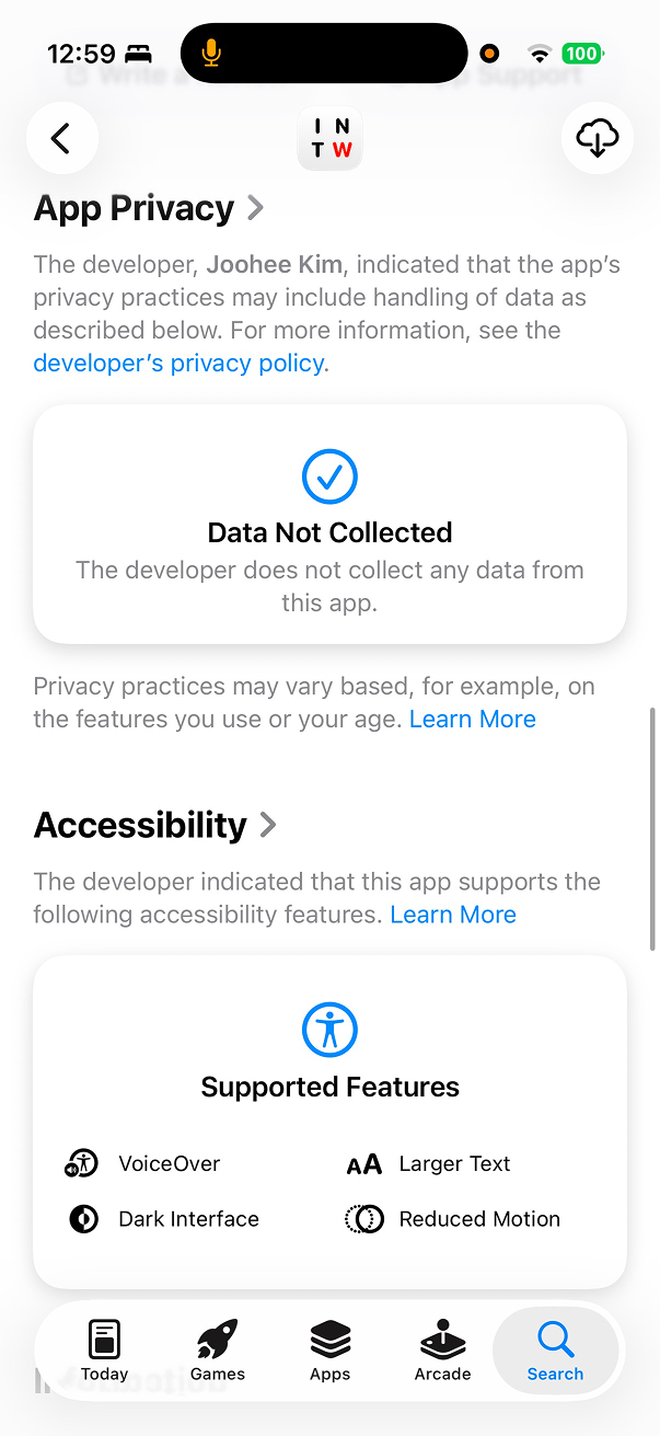
Apple provides various accessibility features across its devices and platforms, such as VoiceOver, Larger Text, Reduce Motion, and more. Developers can use these tools and APIs in their apps to make them more accessible to users with disabilities.
My First Experience Thinking About Accessibility
At WWDC18, which was my first WWDC, I flew from South Korea to San Jose. It was a great experience to meet many developers from abroad in a different country. I was just starting my iOS career at that time, so I was very excited to be there. The staff at the conference were very energetic, and it felt like I was at a party.
At one of the sessions, I saw an Apple staff member helping a wheelchair user get into the session room. The staff member was very kind and helpful, talking energetically to the user. I do not remember every detail, but watching them spend time together at the session left me with a warm feeling. That was the first time I saw accessibility in action, and it left a strong impression on me. That was one of the first moments I seriously thought about accessibility. Seeing how much Apple cared about it made me want to be part of that too.
Years later, while commuting on the subway, I saw a person using FaceTime and communicating in sign language with their hands. I had never thought much about how FaceTime could help people with hearing disabilities communicate. I had only thought about FaceTime as a normal video call app, but that moment made me realize it can be used for much more. Seeing it in action close to me was a great experience.
Supporting accessibility in apps still does not feel like a high priority here in Korea. In my experience, many people do not care much about accessibility, and it is often treated as low priority because making more money is seen as more important. It can be hard to change this mindset: “Does supporting accessibility make more money?” But I hope more people can understand the importance of accessibility and make it a priority in their apps.
There are many classes helping elderly people learn how to use smartphones, and using tablets or kiosks to order food is becoming more common. But these things still often lack proper accessibility support. They may support larger text, but the full user experience is still not very good for users who are not familiar with smart devices. Seeing this made me want to support accessibility in my apps even more.
Supporting Accessibility in I Need That Widget
Around the time of GAAD, I thought it was a good time to support accessibility in my app. At first, I mainly thought about supporting Larger Text. Since my app is focused on widgets, there are limits to what I can support. But after learning more about accessibility, I found that I could also support VoiceOver and Reduce Motion. There were some animations in the app, so I could improve those too.
Resources To Learn Accessibility
First, I started reading documents and watching videos about accessibility. Apple has a dedicated page for accessibility in the Human Interface Guidelines, and there are many WWDC videos about accessibility too. I watched many of them and read the documents to better understand what accessibility is and how to support it in my app.
Here are some of the resources I found helpful:
- Accessibility in Human Interface Guidelines
- Deliver an Exceptional Accessibility Experience
- WWDC18, UIKit.
- This session goes beyond the basics and shows great examples of how to support VoiceOver well.
- Writing Great Accessibility Labels
- WWDC19, UIKit.
- This session explains how accessibility labels work and how to make them better. Writing good labels with the right context is important for VoiceOver.
- Accessibility in SwiftUI
- WWDC19, SwiftUI.
- This session shows how to support accessibility in SwiftUI. SwiftUI gives a good baseline, but you still need to add semantics in the right places.
- Make your app visually accessible
- WWDC20, SwiftUI.
- This session shows how to use color, readable text, and other visual settings to make your app more visually accessible.
- Get started with Dynamic Type
- WWDC24, SwiftUI.
- This session helped me understand Dynamic Type better, especially how layout also needs to adapt, not just font size.
The Basics
These are some of the most commonly used accessibility functions, so here is a quick summary:
accessibilityLabel: what this element isaccessibilityValue: the current state or value of the elementaccessibilityHint: what happens when the user interacts with itaccessibilityElement(children: .ignore): treat this view as one accessibility element and ignore its child elements individually
They are small APIs, but they come up often when adding accessibility semantics, especially when working on VoiceOver support.
Accessible Interaction And Control Semantics
1. A custom row should become a real accessible button
After reading and watching those resources, I started implementing accessibility in my app. I first started with the onboarding flow. At the end of onboarding, there are rows for asking calendar and reminder permissions. They were originally just tappable custom rows, which is not great for accessibility. If something is actionable, assistive technologies should understand it as a real control.
So I changed it to a Button. If users can act on something, accessibility should see a real control, not a visual imitation. Visually, almost nothing changed, but it became much more accessible.
// Before
HStack {
    icon
    titleAndDescription
    Spacer()
}
.contentShape(Rectangle())
.onTapGesture {
    guard !isLoading else { return }
    performAction()
}

// After
Button {
    performAction()
} label: {
    HStack {
        icon
        titleAndDescription
        Spacer()
    }
    .contentShape(Rectangle())
}
.buttonStyle(.plain)
.disabled(isLoading)
.accessibilityElement(children: .ignore)
.accessibilityLabel(accessibilityLabel)
.accessibilityValue(accessibilityStatus)
.accessibilityHint(accessibilityHint)
2. Page indicators and onboarding actions should communicate progress and intent
The onboarding flow has page indicators and CTA buttons. These should not just be visual elements. They also need to express progress and intent.
For the page indicators, I grouped them into one accessibility element, hid the visual-only shapes, and added an accessibility label to read the progress. For buttons, I added hints to explain what the button does.
// Before
HStack(spacing: 8) {
    ForEach(pages) { page in
        Circle()
            .fill(currentPage == page ? .primary : .secondary.opacity(0.3))
            .frame(width: 8, height: 8)
    }
}

Button(action: onComplete) {
    Text("Get Started")
}
.disabled(!canCompleteOnboarding)

Button(action: nextSlide) {
    Text("Next")
}

// After
HStack(spacing: 8) {
    ForEach(pages) { page in
        Capsule()
            .fill(currentPage == page ? .primary : .secondary.opacity(0.3))
            .accessibilityHidden(true)
    }
}
.accessibilityElement(children: .ignore)
.accessibilityLabel(pageIndicatorAccessibilityLabel)

Button(action: onComplete) {
    Text("Get Started")
}
.disabled(!canCompleteOnboarding)
.accessibilityHint("Complete onboarding")

Button(action: nextSlide) {
    Text("Next")
}
.accessibilityHint("Show the next onboarding page")
3. Selection rows should announce state directly
Visually, I used a checkmark image to indicate the selection state of a row. But for VoiceOver, that is not very helpful if it just reads the image as “checkmark.” Instead of exposing the checkmark itself, I hid it with accessibilityHidden(true) and added an accessibility value to read the state directly.
If it is selected, it reads “Selected.” If it is not selected, it reads “Not selected.” Explicitly providing the state is much better than depending on a visual icon.
// Before
Button(action: onToggle) {
    HStack {
        Text(title)
        Spacer()

        if isSelected {
            Image(systemName: "checkmark")
        }
    }
}
.buttonStyle(.plain)

// After
Button(action: onToggle) {
    HStack {
        Text(title)
        Spacer()

        if isSelected {
            Image(systemName: "checkmark")
                .accessibilityHidden(true)
        }
    }
    .contentShape(Rectangle())
}
.buttonStyle(.plain)
.accessibilityElement(children: .ignore)
.accessibilityLabel(title)
.accessibilityValue(isSelected ? "Selected" : "Not selected")
.accessibilityHint(accessibilityHint)
Accessibility Labels And Spoken Semantics
1. Icon-only navigation should get explicit control semantics
In the app, there are icon-only navigation bar buttons. They are visually clear, but they do not have enough meaning for assistive technologies by default. I added explicit accessibility labels and hints to make them more understandable.
// Before
NavigationLink(destination: SettingsView()) {
    Image(systemName: "gear")
        .foregroundColor(.blue)
}

// After
NavigationLink(destination: SettingsView()) {
    Label("Settings", systemImage: "gear")
        .labelStyle(.iconOnly)
        .foregroundColor(.blue)
}
.accessibilityLabel("Settings")
.accessibilityHint("Opens app settings")
It is important to provide enough context so users can understand what the control does, not just what icon it shows.
2. Spoken time should be formatted for listening, not just reused from visual UI
Working with numbers and time in VoiceOver needs more attention than I expected. Time is usually formatted for visual reading, but that is not always good for listening.
For example, 9:00 AM - 10:00 AM is fine visually, but for VoiceOver it is clearer to build something like “From 9 AM to 10 AM.”
Instead of reusing the visual time string directly, I created a separate computed property, accessibilityTimeText, and used it inside a custom accessibility label for the row.
HStack(alignment: .top, spacing: 12) {
    icon
        .accessibilityHidden(true)

    VStack(alignment: .leading, spacing: 4) {
        Text(title)

        if shouldShowAllDay {
            Text("All day")
        } else {
            Text(visualTimeText)
        }

        if !groupName.isEmpty {
            Text(groupName)
        }
    }

    Spacer(minLength: 0)
}
.accessibilityElement(children: .combine) // Read the row as one combined element.
.accessibilityLabel(accessibilityText)

private var accessibilityText: String {
    let timeText = accessibilityTimeText

    if groupName.isEmpty {
        return "Item \(title), \(timeText)"
    }

    return "Item \(title), \(timeText), group \(groupName)"
}

private var accessibilityTimeText: String {
    if shouldShowAllDay {
        return "All day"
    }

    guard let endDate = endDate else {
        return accessibleTimeString(from: startDate)
    }

    if Calendar.current.isDate(startDate, inSameDayAs: endDate),
       startDate != endDate {
        return "From \(accessibleTimeString(from: startDate)) to \(accessibleTimeString(from: endDate))"
    }

    return visualTimeText
}

private func accessibleTimeString(from date: Date) -> String {
    let formatter = DateFormatter()
    formatter.locale = .current
    formatter.timeStyle = .short
    return formatter.string(from: date)
}
3. Spoken summaries should be written intentionally
While testing with VoiceOver, I noticed that it was reading all the elements inside a row one by one. It should read as one useful sentence, not as disconnected visual fragments.
So I built a custom spoken summary for the row. That way, VoiceOver can say something more meaningful and easier to understand. I used .accessibilityElement(children: .combine) together with a custom accessibilityLabel so the row is read as one intentional sentence.
HStack(alignment: .top, spacing: 12) {
    icon
        .accessibilityHidden(true)

    VStack(alignment: .leading, spacing: 4) {
        Text(title)
        Text(detail)

        if !groupName.isEmpty {
            Text(groupName)
        }
    }

    Spacer(minLength: 0)
}
.accessibilityElement(children: .combine) // Read the row as one combined element.
.accessibilityLabel(accessibilityText)

private var accessibilityText: String {
    if groupName.isEmpty {
        return "Item \(title), \(detail)"
    }

    return "Item \(title), \(detail), group \(groupName)"
}
That was one of the moments when I felt accessibility is not just about attaching modifiers. You also have to think about how the UI should sound.
Reduce Motion Support For Animations
The app has some animations, such as onboarding page transitions and layout transitions. I added support for Reduce Motion by checking the accessibilityReduceMotion environment value. If Reduce Motion is enabled, I disable some animations and use a simpler fade transition instead.
It is important to respect the user’s motion preference and provide an alternative experience that is still usable and pleasant. Fancy animations can look nice, but they can also cause discomfort for some users.
// Before
private var headerTransition: AnyTransition {
    .opacity.combined(with: .move(edge: .top))
}

var body: some View {
    content
        .transition(headerTransition)

    indicator
        .animation(.easeInOut, value: currentStep)

    Button("Change Layout") {
        withAnimation(.spring(duration: 0.35, bounce: 0)) {
            mode = .alternate
        }
    }
}

// After
@Environment(\.accessibilityReduceMotion) private var reduceMotion

private var headerTransition: AnyTransition {
    reduceMotion ? .opacity : .opacity.combined(with: .move(edge: .top))
}

var body: some View {
    content
        .transition(headerTransition)

    indicator
        .apply { view in
            if reduceMotion {
                view
            } else {
                view.animation(.easeInOut, value: currentStep)
            }
        }

    Button("Change Layout") {
        guard !reduceMotion else {
            mode = .alternate
            return
        }

        withAnimation(.spring(duration: 0.35, bounce: 0)) {
            mode = .alternate
        }
    }
}
Dynamic Type And Visual Layout Adaptation
1. Not everything should scale the same way
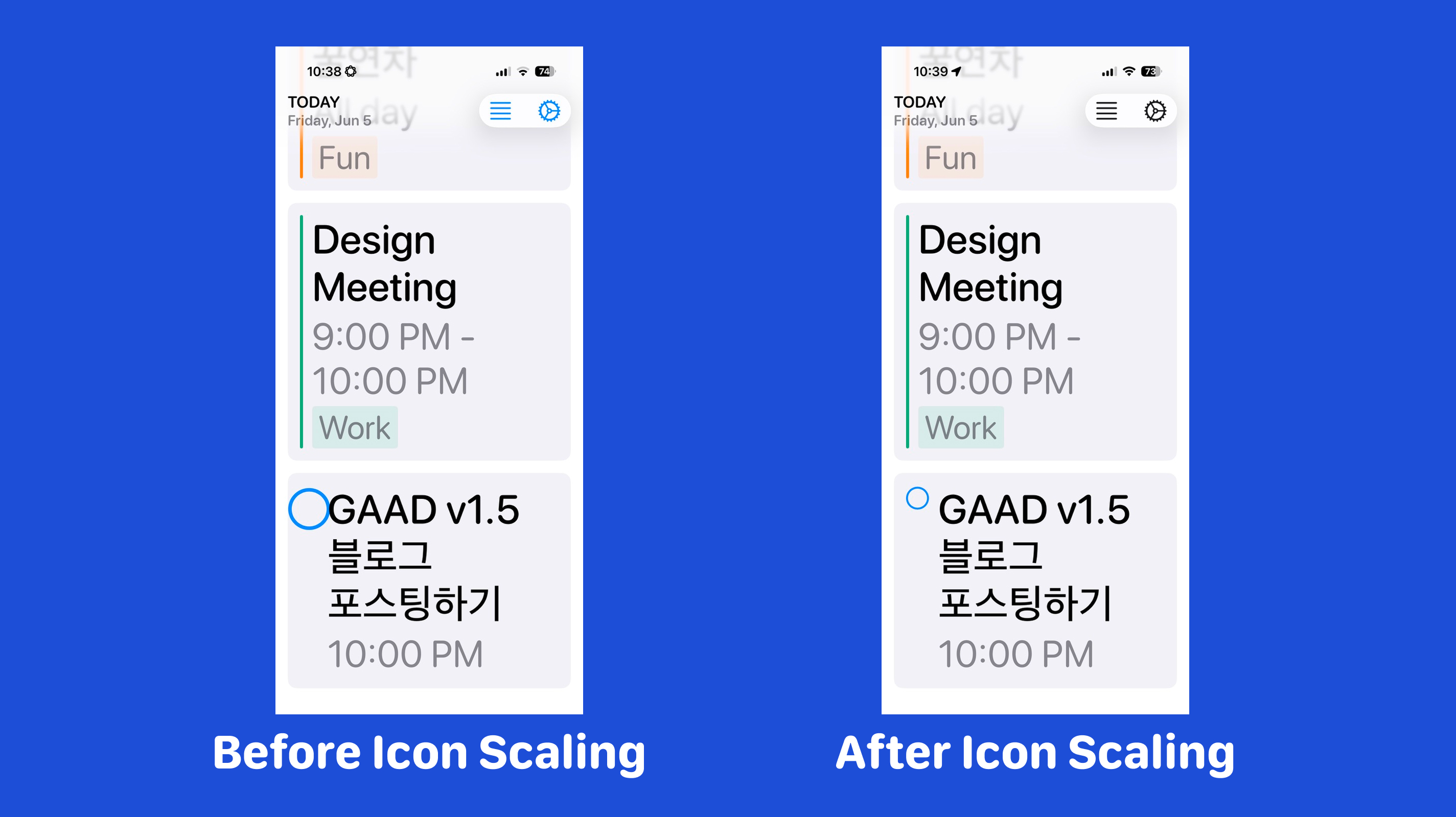
Sometimes supporting Dynamic Type does not mean every element should simply become larger. For example, some icons can grow with the text and make the spacing feel tighter. Using @ScaledMetric lets non-text values participate in Dynamic Type too, but in a more controlled way. It allows values like icon sizes, spacing, or padding to scale along with text instead of staying fixed.
The icon gets bigger up to a limit, which helps it scale while still preserving the layout.
// Before
struct ItemRowView: View {
    var body: some View {
        HStack(alignment: .top, spacing: 12) {
            Image(systemName: "circle")
                .font(.title3)
                .frame(width: 24)

            Text(title)
        }
    }
}

// After
struct ItemRowView: View {
    @ScaledMetric(relativeTo: .body) private var scaledIconSize = 20
    private var iconSize: CGFloat { min(scaledIconSize, 28) }

    var body: some View {
        HStack(alignment: .top, spacing: 12) {
            Image(systemName: "circle")
                .font(.system(size: iconSize))
                .frame(width: 28)

            Text(title)
                .lineLimit(nil)
        }
    }
}
2. Sometimes compact UI should change structure
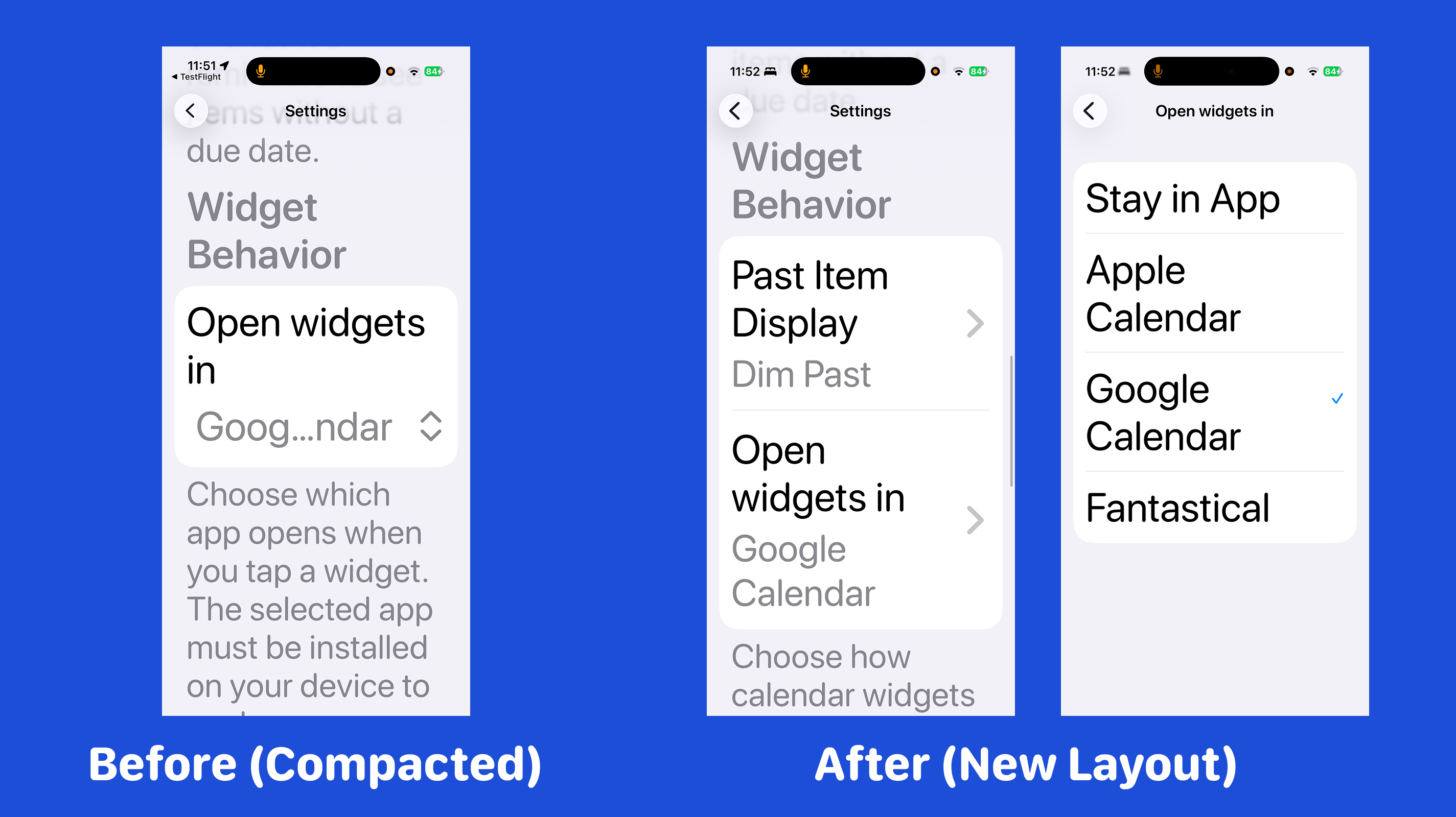
I had been using pickers for selecting things like display mode or app destination. When testing with larger text sizes, I noticed the selected value could get trimmed. So instead of keeping everything inline, I changed some of those controls into navigation rows that open separate selection pages.
That gave more space for larger text and made the value easier to read below the title. Sometimes a compact design has to change for better accessibility.
// Before
Form {
    Section {
        Picker("Display Mode", selection: $selectedDisplayMode) {
            ForEach(DisplayMode.allCases, id: \.self) { mode in
                Text(mode.displayName).tag(mode)
            }
        }

        Picker("Open In", selection: $selectedDestination) {
            ForEach(OpenTarget.allCases, id: \.self) { target in
                Text(target.displayName).tag(target)
            }
        }
    }
}

// After
Form {
    Section {
        NavigationLink {
            DisplayModeSelectionView(selection: $selectedDisplayMode)
        } label: {
            SettingsOptionRow(
                title: "Display Mode",
                value: selectedDisplayMode.displayName
            )
        }

        NavigationLink {
            OpenTargetSelectionView(selection: $selectedDestination)
        } label: {
            SettingsOptionRow(
                title: "Open In",
                value: selectedDestination.displayName
            )
        }
    }
}
Overlay Accessibility
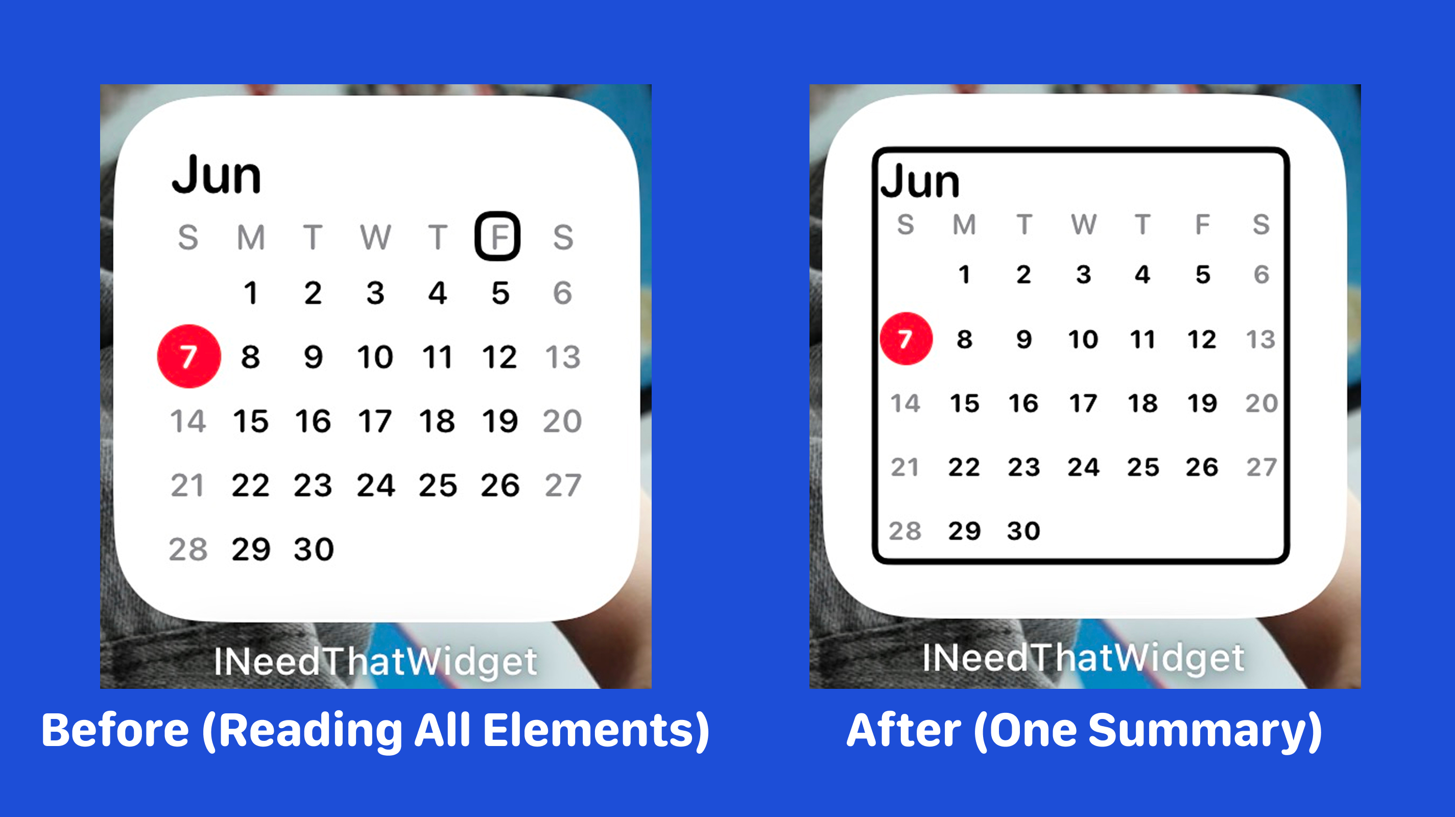
Sometimes, instead of reading every detail, one summary is better.
For example, a small calendar widget does not always need to read every visual date cell. If you do not hide the inner elements, VoiceOver may read many small texts one by one. To change that into one summary element, I added a WidgetAccessibilityOverlay that fills the whole view, so VoiceOver focuses on one summary instead of one small visible element.
// Before
struct SmallWidgetView: View {
    var body: some View {
        visualContent
    }
}

// After
struct SmallWidgetView: View {
    var body: some View {
        ZStack(alignment: .topLeading) {
            visualContent
                .accessibilityHidden(true)

            AccessibilityOverlay(label: summaryText)
        }
    }
}

struct AccessibilityOverlay: View {
    let label: String

    var body: some View {
        Rectangle()
            .fill(Color.primary.opacity(0.001))
            .contentShape(Rectangle())
            .accessibilityElement()
            .accessibilityLabel(label)
    }
}
Important implementation detail
Do not use Color.clear for this overlay. In widgets, fully transparent views may be pruned from the accessibility tree, so VoiceOver may skip them. A nearly invisible fill worked much better for me.
Rectangle()
    .fill(Color.primary.opacity(0.001))
This was one of those small implementation details I only learned by actually testing it.
Test, Test, Test!
You may have noticed that I tested a lot while implementing these accessibility features. This is important because you really have to use the features yourself to understand how accessibility works in practice.
Questions like these came up constantly while testing:
- Does larger text hide visual elements?
- Can I still read all the content?
- Can I scroll to see everything I need?
- What exactly does VoiceOver say for this element?
- Is it saying it correctly?
- Does this interaction still feel okay with Reduce Motion enabled?
By testing directly, you get a better sense of how accessibility tools work and how to make your app actually usable.
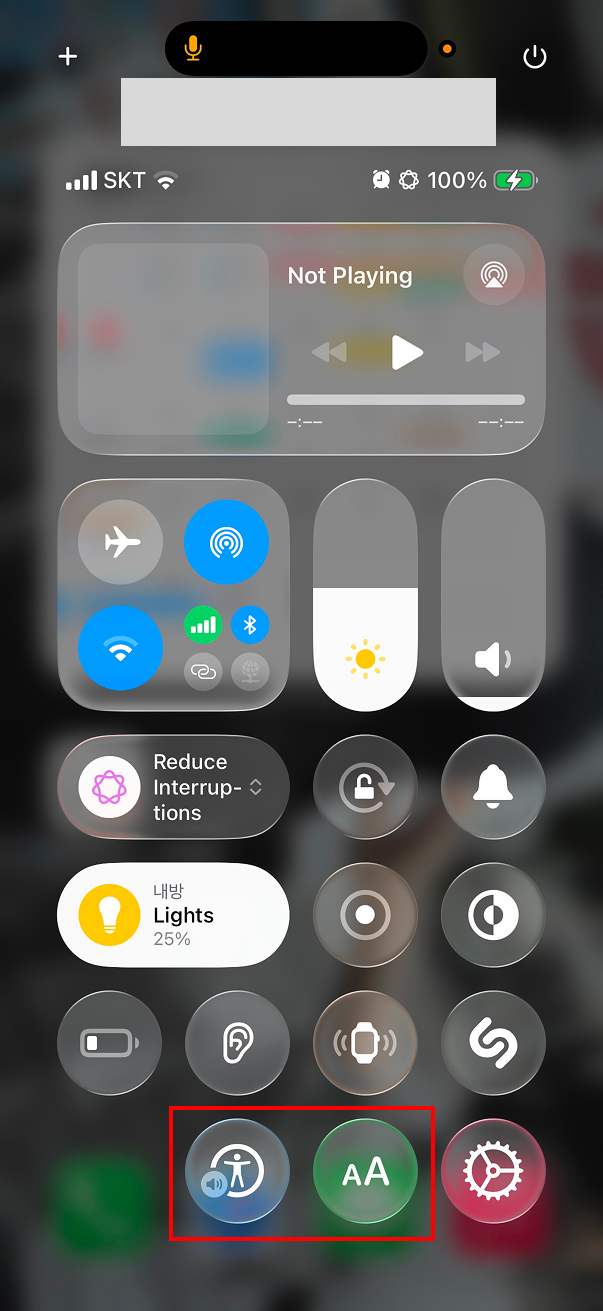
For faster testing, I added VoiceOver and Text Size controls to Control Center so I could switch them quickly while working.
Conclusion
Supporting accessibility is not especially hard because Apple provides great accessibility APIs, but doing it well still takes time, testing, and iteration.
Before this work, I mostly thought about whether the UI looked fine. During this work, I started asking different questions: Does this control make sense when spoken aloud? Does larger text still preserve the layout? Does this motion feel comfortable? Should this widget expose every visible element, or would one summary be better?
That shift in thinking was the most valuable part of this experience.
Accessibility is not only about edge cases. It is about making your app more understandable and more usable for more people. I still have a lot to learn, but after working on this update, accessibility feels much less like a special topic and much more like a normal part of building a good app.